Have you ever found yourself staring at a weather map, feeling completely lost and confused?
As if the symbols and colors are some sorts of secret code only decipherable by professional meteorologists.
Well, fear not! With some knowledge and practice, anyone can learn how to read a weather map like a pro.
In this article, we will dive into the world of weather maps and explore different types of maps and meteorological terms so that the next time you see one on your local news channel or favorite website, you’ll understand it easily.
So grab your umbrella (just in case), and let’s start!
What is a Weather Map?
A weather map visually represents the current and predicted atmospheric conditions for a given area.
It displays information such as temperature, wind direction, precipitation, and air pressure using symbols and colors to provide a quick overview of weather patterns.
Weather maps are created by meteorologists who use data from various sources such as satellites, radar systems, weather stations, and computer models. They then analyze this information to create forecasts that help people plan their day-to-day activities.
One of the most common types of weather maps is the surface analysis chart which shows current conditions on the ground level. Another type is the upper-level map which displays conditions higher up in the atmosphere.
Some popular sources for accessing these maps include local news channels or websites like The Weather Channel or Accuweather.com. Understanding how to read these maps can be extremely helpful when planning outdoor or travel activities.
Weather maps serve as essential tools for meteorologists in predicting daily weather patterns while also providing valuable insights into long-term climate trends.
How to Read a Weather Map
Weather maps can be pretty intimidating for those unfamiliar, but they’re handy for understanding weather patterns and making informed decisions about your day.
To read a weather map like a professional meteorologist, you’ll need to understand the symbols and colors used on the map.
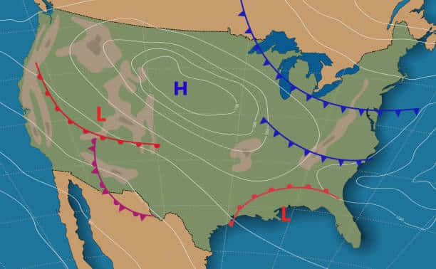
Firstly, pay attention to the isobars – these lines connect areas of equal pressure. The closer together these lines are, the stronger the wind will be in that area. It would be best to look out for high- and low-pressure systems, usually denoted by an “H” or “L,” respectively.
Secondly, take note of any fronts on the map – these show where two different air masses meet. Warm fronts occur when warm air replaces cooler air, while cold fronts happen when colder air pushes into warmer regions.
Make sure you understand what all of the different symbols mean. For example, rain clouds might be represented as blue triangles, while snowflakes could be depicted as white dots.
By learning how to read a weather map correctly, you’ll gain valuable insights into upcoming weather conditions and feel more prepared for whatever Mother Nature has in store!
Types of Weather Fronts
A weather front is a boundary separating two air masses of different densities. These air masses can have large temperature contrasts over a short distance on either side of the front.
If it sounds a bit aggressive, that’s because it is—meteorologists gave these boundaries this name for the similarity to a military unit moving across a battlefield. The air masses separated by a front will often have contrasting properties. There is usually a shift in wind direction across the front and changes in temperature and humidity.
Although not always the case, most of these fronts will be guided by the polar and subtropical jets, changing the weather as they pass. There are four main types of fronts—cold, warm, occluded, and stationary fronts.
Cold Fronts
The cold front is usually the most active of the four major weather fronts. A cold front is the leading edge of a cold air mass that replaces and pushes a warm air mass ahead.
Because colder air is denser than warmer air, a cold front pushes the warmer air higher. As the warm air rises, it causes an area of low pressure along the cold front; as this occurs, it can cause the formation of a narrow line of showers and thunderstorms when enough moisture is present (as shown below in the diagram from the Met Office UK).
Cold weather fronts generally move from northwest to southeast. When a cold front passes through, temperatures can drop significantly. The air behind a cold front is noticeably colder and drier than the air ahead. In addition, they can bring about gusty, shifting winds.
Cold fronts on a weather map are depicted as a blue line with triangles on it, the triangles indicating the direction of its movement.
Image Credit: Met Office UK
Warm Fronts
Warm fronts are the opposite of cold fronts, where the warmer air mass replaces the colder air mass. Warmer air is less dense, so unlike the cold front, it will lift over the top of the colder air as it moves through (see diagram).
They typically move from southwest to northeast and increase both temperature and humidity as the air behind the front is warmer and moister than the air ahead.
Warm fronts are red lines with semicircles, with those semicircles pointing toward its movement.
Occluded Fronts
An occlusion in meteorology is when a cold front catches up to the warm front as it typically moves faster than warm fronts. As a result, the warm air mass is forced up, forming an occlusion. There are two types of occlusions, but they are represented by the same symbol on a weather map. Occluded fronts are shown in purple with alternating triangles and semicircles on the side pointing to its direction of movement.
Image Credit: NOAA
In a cold occlusion, the most common, the air behind the occlusion is colder than the air out ahead in the warm front. The cold front overtakes the warm front and undercuts the more excellent air mass ahead of the warm front.
Image Credit: NOAA
A warm occlusion occurs when the air associated with the cold front behind the occluded front is warmer and less dense than the air mass in the warm front ahead of it. The warm air is pushed up as before, but now the colder, more dense air mass in the warm front remains at the surface forcing the air mass associated with the less dense and warmer cold front up.
Stationary Fronts
As the name implies, stationary fronts are cold or warm fronts that no longer move as a balance exists between the cold and warm air masses on either side of the front so neither air mass can advance on the other.
The blue triangles of the cold front point toward the warmer air, and the red semicircles of the warm front towards the cold air. One of its most noticeable features is a marked temperature and wind direction change when crossing from one side of a stationary front to the other.
Less Common Symbols
The following symbols are much less common on basic weather maps. However, you might run into these on more advanced weather maps from the NOAA and other sources.
Dry Line
Dry lines are most commonly found in the High Plains states during the spring and early summer. Most areas of the country don’t experience them often, but it’s important to mention the dry line. You can think of these dry lines as a boundary marking the difference in humidity—warm, humid air on one side and dry, hot air on the other. As the drier air behind dry lines lifts the moist air ahead of it, it can trigger the development of thunderstorms and sometimes severe tornadic thunderstorms along and ahead of the dry line.
Troughs
Troughs are not fronts like the above symbols but elongated areas of lower atmospheric pressure (we’ll talk about highs and lows next). There’s no change in air mass across a trough, but you’ll notice changes in wind direction.
Troughs reflect the change in the atmospheric conditions in the upper atmosphere. As such, troughs can be areas where showers and thunderstorms can form.
Squall Line
On some advanced maps, meteorologists will place the squall line symbol to indicate the presence of an organized and severe line of thunderstorms. This line of thunderstorms generally forms along a front, and the storm then moves ahead of the front. They are usually seen ahead of cold fronts and dry lines and can produce extended and fast-moving severe weather in heavy rainfall, strong winds, hail, and lightning.
Understanding High and Low-Pressure Systems
Fronts aren’t the only things you see on a weather map. Meteorologists also like to plot areas of high and low pressure, and sometimes lines of equal pressure, called isobars. This information is just as important as the location of fronts, as it provides valuable clues for the day-to-day changes in our weather.
The earth’s atmosphere exerts pressure onto the surface, directly influencing air movement. H areas air warms, it ascends, leading to low pressure on the surface. And as the air cools, it descends, leading to high pressure on the surface. High and low-pressure areas are formed by ascending and descending air masses.
Most of the time, low-pressure areas develop unsettled weather with clouds and precipitation. High pressure areas tend to bring settled, dryer weather with clear skies.
High-Pressure Systems
A blue H denotes a high-pressure system on a weather map. A blue H denotes a high-pressure system on a weather map. In a high-pressure system, the atmospheric pressure is higher at its center than in the surrounding areas. Ir usually flows from areas of high pressure to areas of low pressure. From the point of highest pressure, this air moves clockwise (counter-clockwise in the Southern Hemisphere) or anticyclonic manner outward, causing the air above to sink. This is why clouds and precipitation are rare under high pressure.
Low-Pressure Systems
A red L denotes a low-pressure system on a weather map. A low-pressure system is an area where the atmospheric pressure is lower at its center than the areas surrounding it. Air will tend to blow inward towards a low pressure in a counter-clockwise (clockwise in the Southern Hemisphere) or cyclonic manner, causing air to rise at the point the air converges. As the air rises, it cools, and water vapor condenses, forming clouds and often precipitation. This is why low-pressure systems are usually associated with cloudy, rainy weather and thunderstorms.
What Are Isobars?
You’ve most likely seen a weather map with curved lines in various circle-like shapes and sizes. These shapes are usually closer around a low-pressure system and further apart around high-pressure areas.
These are called isobars—they connect points of equal pressure. Isobars are essential in identifying the locations of highs, lows, and even fronts. The numbers measure the atmospheric pressure in millibars.
Isobars also help to provide clues as to the wind direction and the speed of that moving air. When these lines are closer, the pressure gradient is steeper, causing air to move faster, while air moves slower when they’re further apart.
Other Symbols on a Weather Map
While most weather maps will only have the above symbols, more advanced maps will also include some symbols listed in this image from the New Jersey Department of Environmental Protection.
There are a few things you will want to keep in mind. On American weather maps, temperatures are generally listed in Fahrenheit (this isn’t always the case, so be careful!), while maps from international sources will list temperatures in Celsius. The amount of cloud cover is indicated by the extent to which the center circle is filled.
Wind speeds are always listed in knots, and the direction that the wind barbs come out of the center circle indicates the direction the wind is blowing from. If there is precipitation, you’ll see one of the symbols listed in the upper right of the graphic.
Another reporting method to study is the weather station model at the bottom of the graphic. This is a standardized method used worldwide to show weather observations graphically.
For further reference, I have included a synoptic sample chart below, which shows some of these symbols so you can see how it looks on an accurate weather map. See if you can read the map using the key as a guide!
Different Types of Weather Maps
Weather maps come in different types, each serving a specific purpose. The most common type of weather map is the surface analysis chart, which shows high and low-pressure areas and cold and warm fronts.
Meteorologists use these maps to forecast weather patterns for a given area.
Another type of weather map is the upper-level chart, which displays conditions at higher altitudes. These charts help predict changes in atmospheric conditions that can affect surface weather patterns.
Satellite images provide another perspective on weather patterns. They show cloud cover and movements over large geographic areas, helping meteorologists track storm systems as they develop.
Radar maps use radio waves to detect precipitation levels and movement. This data helps predict severe storms like hurricanes and tornadoes.
Specialized maps focus on specific weather events, such as thunderstorms or winter storms. These maps show wind speed, rainfall amounts, or snow accumulations.
Each type of weather map has unique features that make it helpful in forecasting different aspects of the climate system. Using these tools effectively, meteorologists can provide accurate forecasts to help communities prepare for potential hazards associated with extreme weather events.
Introduction to Weather Maps
Weather maps are essential tools for meteorologists and weather enthusiasts alike.
These maps visually represent current and future weather patterns, giving us a glimpse into the complex world of atmospheric science.
At first glance, weather maps may look confusing with their intricate lines, symbols, and colors. However, understanding how to read them can provide valuable insights into upcoming weather conditions in your area.
Weather maps come in different types depending on what information they display. Some common ones include surface analysis charts showing high and low-pressure systems and fronts dividing air masses; radar images depicting precipitation; satellite images revealing cloud cover; and temperature or wind speed models over time.
As you delve deeper into reading these various weather maps, you’ll begin to encounter specific meteorological terms such as isobars (lines connecting areas of equal pressure), dew point (the temperature at which moisture condenses), or jet streams (fast-moving air currents). Familiarizing yourself with these terms will help you understand the information presented by each map fully.
Learning how to read a weather map takes practice but can be an enjoyable experience for anyone interested in understanding the forces behind our daily changing climate.
Types of Weather Maps
Weather maps come in different types, each providing specific information about the weather. The most common types are surface analysis maps, radar maps, satellite imagery maps, and upper-level charts.
Surface analysis maps show the current state of the atmosphere at ground level. They display information such as temperature, pressure systems, and precipitation levels. These types of weather maps help predict short-term weather patterns.
Radar maps use radar technology to detect precipitation levels in a given area. They provide real-time updates on rainfall intensity and location. This map type is essential for monitoring severe storms or other extreme weather events.
Satellite imagery maps are used to observe cloud coverage across large regions. They can help predict patterns in cloud movement and anticipate changes in weather conditions over time.
Upper-level charts depict atmospheric data above ground level. These include temperature readings at various altitudes and wind direction data that can be crucial for tracking potential storm formations.
Understanding these different types of weather maps is essential to interpreting meteorological forecasts accurately. Knowing how each map works together allows us to make informed decisions based on atmospheric conditions.
Meteorological Terms
Meteorological terms are often used in weather maps to describe different atmospheric conditions. Understanding these terms is essential when reading a weather map like a professional meteorologist.
One of the most common meteorological terms on a weather map is “pressure.” Pressure refers to the force exerted by the atmosphere on an object, and it can be measured using units such as millibars or inches of mercury.
Another important term is “front,” which refers to the boundary between two air masses with different temperatures and humidity levels. On a weather map, fronts are represented by lines with various symbols indicating their type (cold front, warm front, stationary front).
The term “isobar” also appears frequently on weather maps. An isobar represents lines connecting areas with equal pressure values. These lines help meteorologists identify high-pressure and low-pressure systems that affect our daily lives.
Other critical meteorological terms include dew point (the temperature at which water vapor condenses), relative humidity (the amount of moisture in the air compared to its maximum capacity), and wind direction/speed.
Understanding these concepts allows you to read any weather map like a pro!
Conclusion
Reading a weather map like a professional meteorologist is not easy, but with practice and patience, anyone can learn how to do it. It requires understanding different types of maps, learning the various meteorological terms used on these maps, and interpreting them correctly.
Remember that weather forecasting is not an exact science, so always consider any updates or changes in the forecast before making decisions based on it.
You can stay safe during severe weather events by keeping up-to-date with current weather conditions and using your knowledge of reading weather maps.
Being able to read a weather map like a professional meteorologist takes time and effort. But by following the tips outlined in this article and practicing regularly, you will become more confident in interpreting complex data presented on these maps.
Whether planning outdoor activities or just wanting to know what’s coming your way, knowing how to read a weather map is essential for everyone.

